PACKAGING AND MERCHANDISING DESIGN - TASK 3 -
INNOVATIVE PACKAGING AND MERCHANDISING
23rd October 2024 - 23rd December 2024
Reynard Wu / 0366763
Bachelor of Design (hons) in Creative Media
INSTRUCTION
LECTURES:
- Planogram:Planogram is a detailed plan used by retailers to organize store layouts and product displays to increase sales and improve the shopping experience. It shows where products should go on shelves and in different areas of the store.
 Good planograms place related products near each other to encourage customers to buy multiple items. Since shoppers usually focus on a section for only 5–6 seconds, placing products carefully is important for making sales.
Suppliers also pay attention to planograms because they can strongly affect how well products sell. The purpose of the planogram is to help the store efficient for smaller retailer it really helps saving spaces. Planogram also boost visual appeal and promote product pairing suggestions. But a planogram’s ultimate goal is to help the store drive sales.


Artwork for Task 3:
For this task we are required to team up with 2 other classmates and work together for this final task which is desiggning product for the SBS studend (School of Bio science) the SBS student will provide us with their brand logo and their product detail.
Goji Tang Introduction :
Goji - Tang is a gelato made with goji berry as their main sweetener, the team wanted to create Gelato that have a healthy and bold flavor that can bridge traditional flavor with their customers. They came out of flavors such as osmanthus flavored gelato.
Design Direction ;

at the first meeting the sbs student wanted something similar to chagee With only 2 color, Simple, Minimalistic yet elegant it's all they wanted in their gelato packaging design. And with that information we starting to creating a moodboard for our first step to this project
The image on the top left is how we want the Osmanthus illustration look like, the bottom left one is the reference on how we want for our logo placement design. The center image is a layout reference. On the right are the color and layout aesthetic we wanted to go for our packaging design.
Font Selection:
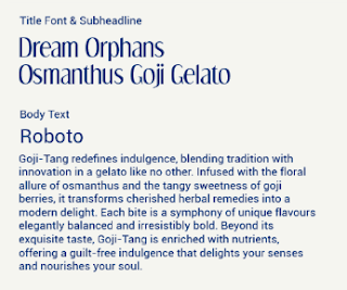
For the font that we use for title and subhead line is Dreamorphan because it's a decorative font and also has a unique curve and thickness to it. For the body paragraph we use roboto font because it gives the customer easier readability and makes the paragraph looks simpler

For the color palettes we choose dark blue and pale white because base on customer request they want a minimalistic design and yet has a luxury sense to it. We choose this particular because of it contrast and each color symbolize freshness and purity.

The view from on top of the cap

Final Presentation:

For the font that we use for title and subhead line is Dreamorphan because it's a decorative font and also has a unique curve and thickness to it. For the body paragraph we use roboto font because it gives the customer easier readability and makes the paragraph looks simpler

For the color palettes we choose dark blue and pale white because base on customer request they want a minimalistic design and yet has a luxury sense to it. We choose this particular because of it contrast and each color symbolize freshness and purity.
Illustration:

Goji Berry Illustration and osmanthus

Goji Berry Illustration and osmanthus
Packaging Layout:
We use the osmanthus flower and goji berry illustration to give more that goji berry essence to it, and we use the orginal logo to give the emblem that contrast so it doesn't look too plain.

The Layout of our packaging design

The view from on top of the cap

The dyeline of our goji berry gelato cup


.png)

.png)


Compilation of all our merchandise
Merchandise for our brand

Front view of our Gelato cup mockup

View from side and above of our Gelato Cup

Goji tang three-wheeler motorcycle / Ice cream cart

Gelato cooler/chiller mockup

.png)
Back view of our t-shirt mockup

.png)
Front view of out t-shirt mockup

Goji tang bowl mockup

Goji tang coffee cup mockup

Goji tang billboard


Goji Tang Shops mockup

Feedback
Week 6: Collecting information about the brand that we collaborate with and also setting a meeting between us on Sunday.
Week7: Knowing better about the ingredients that they use in order to make different variety of flavors with it. And each of us in the group make an idea about the mockup
Week 8: Independent learning week
Week 9: we like the contrast and the aesthetic of our mockups and then we finalize the mockup
Week 10: need to do some testing of our printed mockup on actual cup to present it to SBS student
Week 11: Finishing our merchandise prototype so that we can revise it by the time we showed it to Ms. Vitya
Week 12: Managing the final design mockup for us to present in the upcoming week
Week 13: Finishing all of the merchandise design and present it on 22nd of December at 4pm and finalizing all of our work into one compilation
REFLECTION :
This project taught me a lot about how we working in group and understanding what our client wants, and being used to rejection. Not all of our work will be accepted it either by the lecturer or our groupmates for a better reason. In this project we have to do everything precisely and with creative design. Communication is key in this group project because we can fill each other hole that ourselves won't even notice.
Creating a different yet creative concept are pretty challenging because we have to scroll through internet for our design. But eventually we manage to get through it together and accept every result with big smile on our face.
Komentar
Posting Komentar