TYPOGRAHY
TASK 1 : EXERCISES
Date : 26.09.2023 (week 1) -
03.11.2023
Name : Reynard Wu (0366763)
Course : Bachelor (honours) in creative media
Class : Typograhy
CONTENT
LECTURES
WEEK 1
Typo_0_Eportofolio Briefing
In the first meet in week 1 our lecturers Mr. Vinod and Ms. Low Hsin Yin
showed us a short youtube video about the tutorial to start our
e-portfolio.
Typo_0_Introduction
Typography :
- The style and appearance of printed matter (oxforddictionnaries.com)
- The arrangement of type involves selecting typefaces, point size, line
length, line-spacing, letter-spacing, and adjusting the space within letters
pairs.
- Develop as fundamental aspects to any design studies discipline and way of
expressing.
- Art and technique of arranging type to make written language legible,
readable, and appealing when displayed. Arrangement of type involves selecting
typefaces point size, line length, line-spacing letter spacing and space
within letters pairs.
- Calligraphy is style of writing.
- Lettering is draw the letter.
- Font is individual font or weight within typeface.
- Typeface is entire family of fonts that got similar characteristic.
Typo_1_Development
Early letterform development: Phoenician to Roman
The tool has a very important influence on the type of writing that is
created. it has a major role in crafting the type scripts that have eventually
develop such as clay and stone also the instrument that you hold in your hand
- Phoenicians wrote start from right to left.
- Etruscan wrote from right to left and paint letterform before inscribe it.
- Square capitals (3rd-10th C.E.) is a written version in Roman, they add
serifs to finish their main strokes.
- Rustic capitals (3rd-10th C.E.) is a compress version of Square Capitals,
its allows more words on a sheet of parchment.
- Half-Uncials is a further formalization of cursive hand and it replete
with ascender and descender.
- Blackletter more popular in northern Europe, Rotunda isa rounder more open
hand and its more popular in south.
- Gutenberg marshaled engineering, its required a different brass matrix or
negative impression for each letterform.
- Typeforms develop response to prevailing technology, commercial needs and
esthetic trends.
- Text type can be divide into nine part which is Blackletter, Oldstyle,
Italic, Script, Traditional, Modern, Square serif, Sans seif and Serif.
WEEK 2
Typo_3_Text_P1
Typography: Text/Tracking: Kerning and Letterspacing
Kerning: automatic adjustment of space between letters. mostly
mistakenly referred to as letterspacing. in fact, letterspacing is to add
space between the letters
Tracking : Addition and removal of space in a word or sentence.

Flush left: to align text to the flush left
Centered: created such a strong shape on the page
Flush right: this format places emphasis on the end of a line as
opposed to its start
Justified: this format imposes a symmetrical shape on the text. it is
achieved by expanding or reducing spaces between words, and, sometimes,
between letters.
Texture : Different texture of typefaces suit different
message.
- Type size need to be large enough.
- Leading should be set as suitable.
- Line length better keep between 55-65 character.

- Type specimen book shows sample of typefaces in different text size.

WEEK 3
Typo_4_Text_Part_2
Text/indicating Paragraph
- Pilcrow, a holdover from medieval manuscripts seldom use today.
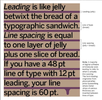
- Line space, if the leading is 12pt the paragraph spacing value should be also
12pt. the purpose for this is because we want to maintain cross
alignment.
- Leading, space between each line of text.
- Widow and orphan should be avoid.
- Text should maintain the left reading axis of text, quotation marks can
break the left reading axis.
- Head should clearly signify to reader, relationship between head and text
is important.
- Cross alignment headlines and caption with text reinforces the
architectural sense of the page.
The sans serif font (universe) has been reduced by .5 to match the x-height
of the serif typeface.8 =7.5
WEEK 4
Typo_2_Basic
As with any craft that has evolved over 500 years, typography employs a
number of technical terms. these mostly describe describe specific parts of
the letterforms. It is a good idea to familiarize yourself with the
lexicon
Baseline the imaginary line the visual base of the
letterforms
Median the imaginary line defining the x-height of letterforms
X-height the height in any typeface of the lowercase 'X'
stroke, any line that defines the basic letterform
Apex/Vertex, the point created by joining two diagonal stems
Arm, short strokes off the stem of the letterform, either
horizontal (E,F,L) or inclined upward (K,Y)
Ascender, the portion of the stem of a lowercase letterform
that projects above the median
Beak, the half serif finish on some horizontal arms
Bowl, the rounded from that describes a counter.
Bracket, the transition between the serif and the stem
- Small capital is uppercase letterform draw to x-height of typeface.
- Uppercase numerals is number that same height and same kerning with
uppercase letter.
- Lowercase numerals is most used with uppercase letter and lowercase
letter.
- Italic refer to 15th century Italian cursive handwriting.
- Punctuation and miscellaneous characters change from typeface to typeface.
Ensure all character available before choose the type is important.
- Ornaments used as flourishes in invitation or certificate.
- Typefaces got differences in x-height and line weight, forms, stroke
widths and feeling.

WEEK 5
Typo_5_Understanding
- The uppercase letter forms suggest symmetry, but in fact it is not
symmetrical. it is easy to see the two different stroke weights of the
baskerville stroke form.
- Uppercase letterforms may appear symmetrical but width of the left slope
will thinner than the right stroke.
- The complexity of letterform can be demonstrated hen examining the
lowercase 'a' of two similar sans-serif typefaces. Its shows the difference
on the stem and the part of bowls meet the stem.
Maintaining x-height
The x-height generally describe the size of the lowercase letterforms.
However, you should keep in mind that curved strokes, such as in 's', must
rise above the median in order to appear to be the same size as the vertical
and horizontal strokes they adjoin.
- Counterform is the space describe and often contained by the strokes of
the form. Its include the space between letters and letters.
- Contrast is a powerful dynamic in design.
WEEK 6
Typo_6_Understanding
- Medium can be divide into two parts which is Print type and Screen type.
Print type need to ensure the readability of text but screen type more focus
on the performance on screen.
- Size of the screen that we used will affect to the text we see because of
the sized pixel different.
.png)
- Static typography only have minimal characteristic in express word
but motion typography present typographic information over time and its
evoke a certain mood to audience in film.
INSTRUCTIONS
Task 1: Exercise - Type Expression
Sketches
Sketches of dive
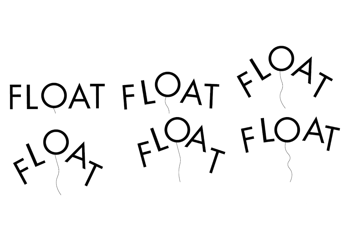
Sketches of float
Sketches of bounce
Sketches of crush
Based on the feedback given I choose Float #1, Dive #3, Crush #2 and Bounce #1 to proceed to
digitization.
Final Static Type Expression (PDF)
Final Animated Type Expression 'Float' (GIF)
Task 2: Exercise - Text Formatting
Kerning and tracking
Layout #1
Fonts : Adobe Caslon Pro (Regular, Bold)
Point Size : 10pt (body text), 55pt (heading)
Leading : 10pt (body text), 12pt (heading)
Paragraph spacing : 12pt
Line length : 111pt, 69pt
Alignment : Left align
Layout #2
Fonts : Futura Std Bold, ITC New Baskerville Std Italic
Point Size : 12pt (body text), 55pt (heading)
Leading : 12pt (body text), 48pt (heading)
Paragraph spacing : 12pt
Line length : 94pt
Alignment : Left align
Layout #3
Fonts : Futura Std (Book, Bold)
Point Size : 15pt (body text), 551pt (heading)
Leading : 12pt (body text), 15pt (heading)
Paragraph spacing : 12pt
Line length : 120pt
Alignment : Left align
Final Task 2: Exercise - Text Formatting
Fonts : Futura Std (Book, Bold)
Point Size : 15pt (body text), 551pt (heading)
Leading : 12pt (body text), 15pt (heading)
Paragraph spacing : 12pt
Line length : 120pt
Alignment : Left align
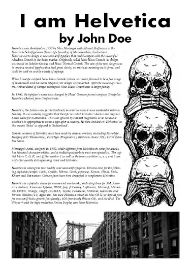
Final Text Formatting with grid (JPG)
Final Text Formatting with grid (PDF)
Final Text Formatting without grid (JPG)
Final Text Formatting without grid (PDF)
FEEDBACK
Week 2
General Feedback : Label the number on sketches, update personal information and do the furthur reading weekly.
Specific feedback : Sketches of Float #1, Dive #3, Crush #2 and
Bounce #1 can be choose to prceed to next step.
Week 3
General Feedback : Digitization looks nice.
Specific feedback : Can choose word 'float' to proceed to
animation.
Week 4
General Feedback : Update further reading and e-portfolio.
Specific feedback : Update the
animation and progress into e-portfolio.
Week 5
General Feedback : Pay attention on cross-alignment and grid.
Specific feedback : Layouts # can be choose to proceed to
final.
REFLECTIONS
Experience
Typography plays a crucial role in our daily lives, evident in the ubiquitous publicity posters strategically designed to captivate attention using font types and sketches for maximum impact. Initially challenged in Task 1, my sketches faced rejection due to a lack of understanding of typography's technical aspects. However, with guidance from the lectures, I now comprehend the vital role typography plays in effective communication, transforming my initial struggles into a newfound appreciation for arranging letters in English text.
Observation
In our lecture, I have observed the fascinating transformation of words into visual art, where typography goes beyond mere letters and becomes a thoughtful dance of forms and spacing. The choices of typeface and layout play a crucial role in completely transforming the mood and message of a design. This experience has deepened my appreciation for the artistic and impactful possibilities that typography offers in design.
Findings
This experience has not only enhanced my understanding of typography but has also allowed me to express myself uniquely and captivate my audience. Typography, as I've come to realize, is more than just a practical skill; it's a powerful form of expression and communication that I've learned to embrace under the guidance of our lecturer, making it my favorite aspect of the course.


Komentar
Posting Komentar