Typography Task 2
(Typographic Exploration & Communication)
30 October 2023
Week 6 - Week 8
2023.10.30 -
2023.11.19
Reynard Wu / 0366763
Typography / Bachelors of Design (Honours) in Creative Media
Task 2: Typographic Exploration & Communication
CONTENT
LECTURES
All lectures 1 to 6 has completed in Typography Exercise Task 1
INSTRUCTIONS
Task 2: Exercise - Type Formatting
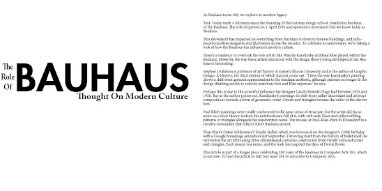
Layout Progress
Layout 1
Fonts : Adobe Caslon Pro Bold
Point Size : 12pt (body text), 36pt, 49pt and 102pt (heading)
Leading : 12pt (body text), 60pt (heading)
Paragraph spacing : 12pt
Line length : 108pt
Alignment : Left align

Layout 2
Fonts : ITC Garomond STD Book Italic, Gil Sans MT Bold, Adobe Caslon Pro
Semibold, Adobe Caslon Pro
Point Size : 12pt (body text), 60pt, 63pt and 121pt (heading)
Leading : 12pt (body text), 60pt (heading)
Paragraph spacing : 12pt
Line length : 108pt
Alignment : Left align
Layout 3
Fonts : Adobe Caslon Pro, Futura Std Heavy
Point Size : 12pt (body text), 25pt and 110pt (heading)
Leading : 12pt (body text), 60pt (heading)
Paragraph spacing : 12pt
Line length : 108pt
Alignment : Left align
Fonts : Adobe Caslon Pro Bold
Point Size : 12pt (body text), 36pt, 49pt and 102pt (heading)
Leading : 12pt (body text), 60pt (heading)
Paragraph spacing : 12pt
Line length : 108pt
Alignment : Left align
Final type formatting with grid (PDF)
Final type formatting without grid (JPG)
Final type formatting without grid (PDF)
FEEDBACK
Week 6 :
General Feedback : We need to pay attention how to attract reader's eye.
Specific feedback :
Week 7 :
General Feedback : Change the access of the pdf file from private to open to public.
Specific feedback :
REFLECTIONS
Experience
I found great pleasure in participating in a fascinating course that
required thoughtful consideration of letter placement. While I had
previously studied letter arrangement in my native language, exploring this
aspect in English proved to be a valuable and enlightening learning
opportunity for me.
Observation
In my observations, I've noticed a diversity of preferences among
individuals when it comes to the prominence of a title. University students
exhibit varying inclinations regarding the prominence levels they prefer for
titles, suggesting a subjective and personalized approach to this aspect of
design. This observation highlights the importance of considering individual
preferences when creating visual content for academic purposes.
Findings
In my design process, I've noticed a tendency to finalize projects based on
momentum rather than starting with a well-thought-out sketch. Recognizing
the need for improvement, I aim to shift my approach towards creating more
comprehensive designs by incorporating a detailed sketching phase. This
adjustment is driven by a desire to enhance the planning stage of my designs
and cultivate a more intentional and strategic approach to my creative work.


Komentar
Posting Komentar